Kultivate Labs
Brownthought Academy
Designing for Futures: Building a Trusted Brand Experience
Role
Web Design Intern (Product Design Focus)
What I did
Product Design, User Research, Prototyping, Product Thinking
Team
Jonathan Remulla
Design Manager
Peter Piczon
Web Designer
Timeline
4 months
Tools
Figma
FigJam
Asana
Slack
Telegram
Context
Kultivate Labs (KL), the nonprofit behind San Francisco's SOMA Pilipinas, needed a central platform for its expanding internship program established 2020. Like a startup continuing to scale, they lacked a cohesive space for users to engage with the program.
The Problem
The internship program lacked a dedicated website, leaving information scattered and hard to find. Without a centralized home, users struggled to learn about the program and apply, limiting its growth. There is an internship program — but no home to call its own :(
Okay... so what did you do?
I set the visual direction and led user research by conducting user interviews, driving measurable increases in user engagement and program participation. My work spanned product design, prototyping, and strategic product thinking to build a cohesive user experience for the platform :)
Outcome
SUMMER - FALL 2024
APPLICATIONS ARE NOW CLOSED. CHECK BACK FOR FUTURE COHORTS!
Explore and deepen your understanding of the Program & Requirements. Learn more about the Admission Process.
Since its launch in June 2023, the site has successfully supported two cohort application cycles and continues to streamline the user experience across mobile and desktop platforms to the broader Kultivate Labs network. Ultimately, our refined product strategy led to:
- •1,754% increase in page views, with users exploring multiple resources on the platform
- •1,684% increase in visits, year-over-year
- •1,470% increase in unique visitors
Constraints
Some parameters we kept in mind as we were working on the project:
I was mentored by a design lead with experience at Meta and Ancestry, whose expertise guided me throughout the process. Alongside a small but dedicated three-person team, we embraced the challenge of building a website — an extensive and complex endeavor. While demanding in scope, it was this very challenge that made solving the problem both engaging and rewarding.
To an extent, we were given a lot of liberty since our stakeholders placed a lot of trust in our judgement with the project. However, we also did need to stay within the confines of brand guidelines, despite our design team's recommendations and sentiments for how branding could be improved for its target user.
Enough said. We also had limited metrics and research to go off of for product development, which meant needing to conduct our own research. I was also the only person on my team in school full-time during my internship, which was something I had to balance as well and a factor that we had to integrate into my team's workflow dynamic.
Most people apply for applications on a desktop. Luckily Squarespace, the platform we used to build out our website, had responsiveness as a feature built into its software. This is a consideration to keep in mind for future iterations and builds for how the product can be improved, hopefully leading to higher turnover rates and more people applying for future generations of cohorts.
So... where did we start?
We gathered key materials to inform our process: branding guidelines, product requirements, stakeholder insights, and initial wireframes. From there, we brainstormed how to bring Brownthought's digital presence to life, laying the groundwork for a unified and impactful platform. We aligned as a team by identifying our strengths and how we could collaborate effectively.
low fidelity → mid fidelity
Some wireframes that I iterated on during the interview process for our 48-hour take-home assignments before we officially became interns, which I shared with the web team while we were brainstorming!
Finding the Materials to Build a Home
After making the blueprints, we set out to find the resources we needed to bring the website to life (kind of like a mini quest!).
Approaches to Research
While also keeping in mind my experience, I also kept in mind the backgrounds of the people I surveyed in the sample with the values and limitation of their backgrounds. Given that we were building another iteration of a website, it is also important to understand the limitations with cost, scale, etc.
I was instructed to conduct user interviews on current interns and employees of Kultivate Labs by my design manager. I found interviews to be a bit biased since most of the people were a part of the same company ecosystem, so the way they view the website comes from a background of understanding of what we do at Kultivate Labs internally. However, if we were to survey users outside of the KL ecosystem or if we were to survey users who went through the interview process (but did not necessarily make it in), we would get a more unbiased sample and may have been able to uncover some perspectives that we do not currently have. At the time, this is what was most easily accessible for conducting virtual interviews on Zoom (in informing the initial ideation of the formal website).
When first approaching the user interviews, I did use the questions I was given by my design manager, but also reflected on my experiences and their potential pain points interviewees may have shared with me. I did want to ask if they shared the same experiences I did and dig more into it, but that would create a potential bandwagon bias or especially a confirmation bias. I only dug further into users experiences that they shared with me if they brought it up first. I did not want to create a confirmation bias in the responses of my users I was sampling since that would potentially influence how they decided to articulate their thoughts, when I wanted the most unbiased, honest opinion in my sample I was surveying.
I conducted 6 unique interviews with interns and employees of KL via Zoom, all of whom are users of the site. In my opinion as a researcher (again I am a designer, but by formal education and background I am also researcher), I would say that we got a pretty good view and read of users' pain points. Though if we collected more data, this may have enabled us to solve larger long-term problems that could be more cost-effective in solving now. Additionally, collecting more data may reveal ideas that we were unable see in our foresight during the initial ideation of the product. However, it is also important to understand the larger organizational limitations with our internship program and company. This is a potential recommendation and development for future iterations of the website, which I articulated with my team and stakeholders.
When building a product, or just solving any problem for that matter, it is easy to assume what problems users may experience. I also know that the pain points seem a bit obvious with the lack of having a centralized website, hard-to-find information, and user navigation difficulties, but research may say otherwise. Ultimately, the truth is in the data. Data and metrics tell stories, which should inform how a product is made.
Laying the Foundation
To ground my design process in real user insights, I conducted qualitative user research through user interviews.
Pain Point #1: Information is Hard to Navigate
Users were forced to juggle between two separate websites, constantly cross-referencing for discrepancies. Unfortunately, this is not a circus (maybe next year). Important information for the application process was buried and inaccessible, when it should have been front and center.
Pain Point #2: Lack of Trust with Brand
“the logo kind of looks a bit outdated and a bit similarly to microsoft word clip art. the hat logo kind of looks out of place since the other logos look more modern.”
User Interview #2“Our generation doesn't like fedoras.” Maybe add a different of hat to “pass on the cap?”
User Interview #3
perceived user takeaways on the branding
Kultivate Labs' success with initiatives like UNDSCVRD SF set high expectations, but without a centralized system, Brownthought Academy was seen as new and lacking credibility. Interviewees felt disconnected from the brand. Although visual elements like brand guidelines and typography were present, they failed to foster a meaningful connection with users, weakening trust. Our goal was to rebuild that trust and establish credibility.
Pain Point #3: Visual Inconsistencies Hinder User Experience
wanted info of Internship Syllabus to be more design, kind of implied expectation in thoughtfulness in design of website would also translate to small things and docs like internship syllabus
User Interview #3Users found the visual design lacking, with inconsistent fonts, an outdated logo, and poorly formatted content. Navigation issues and unclear program details frustrated users, particularly the hard-to-navigate Google Doc format of the internship syllabus. These design flaws failed to meet the high standards expected from Kultivate Labs. To reengage users and boost applications, we knew we had to transform the branding, improve mobile functionality, and redesign how information was presented.
Constructing the Experience
I led user research throughout the project, collaborating closely with my design manager to shape the overall direction. By synthesizing insights from user conversations and a competitive audit, we pinpointed opportunities to streamline onboarding and tailor communications. I also developed mood boards to ensure the website's visual design aligned with our findings and the brand's vision.
Setting Visual Direction
I got excited over potential visions of the website and how I could contribute to those visions.
As a result, I went all in on the mood board... only to hop on a call with my design manager and learn that this is not a mood board :(
Frankly, I felt disappointed in myself for not knowing this and receiving the feedback I did from my manager. I was under the perception that a mood board is a collection of visual inspiration and never really thought about it outside of that. I have been using Pinterest since middle school, so I associated a mood board with just gathering visual artifacts and laying it down on the metaphorical table. However, despite feeling the disappointment within myself that I did, I understood that my design manager was coming from a place of constructive growth.
After this exact conversation, I learned that a mood board in the context of product design is not just putting a bunch of pretty pictures together, but more so about conveying the look, feel, and experience of what we are trying to communicate in the essence of a few visual artifacts.
This time with the guidance and clarification of my design manager, I refined it.
the mood: warm, inviting, confident, modern, and elevated :)
This time, finally having a refined mood board, we had a clear direction for the website. Building it out on Squarespace was surprisingly quick, as we had previous iterations to build from (evolutions below)
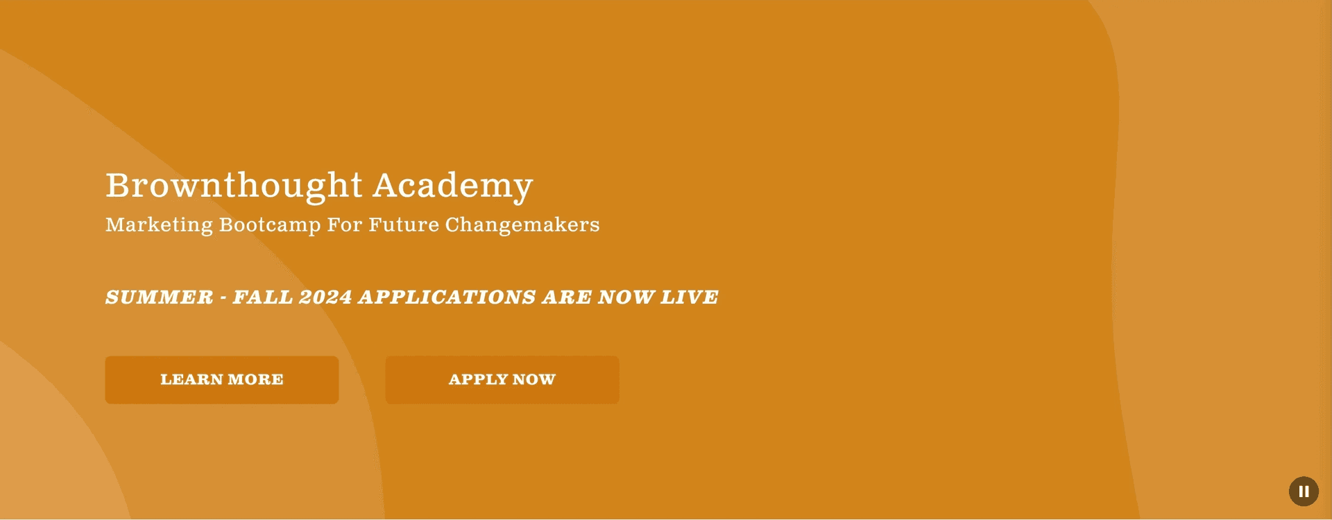
Brownthought
A 5-month paid internship dedicated to shaping the next generation of thought leaders and change makers.
Brownthought Academy's Marketing Bootcamp is a workforce development program from Kultivate Labs...
At long last, we loomed on the horizon of...
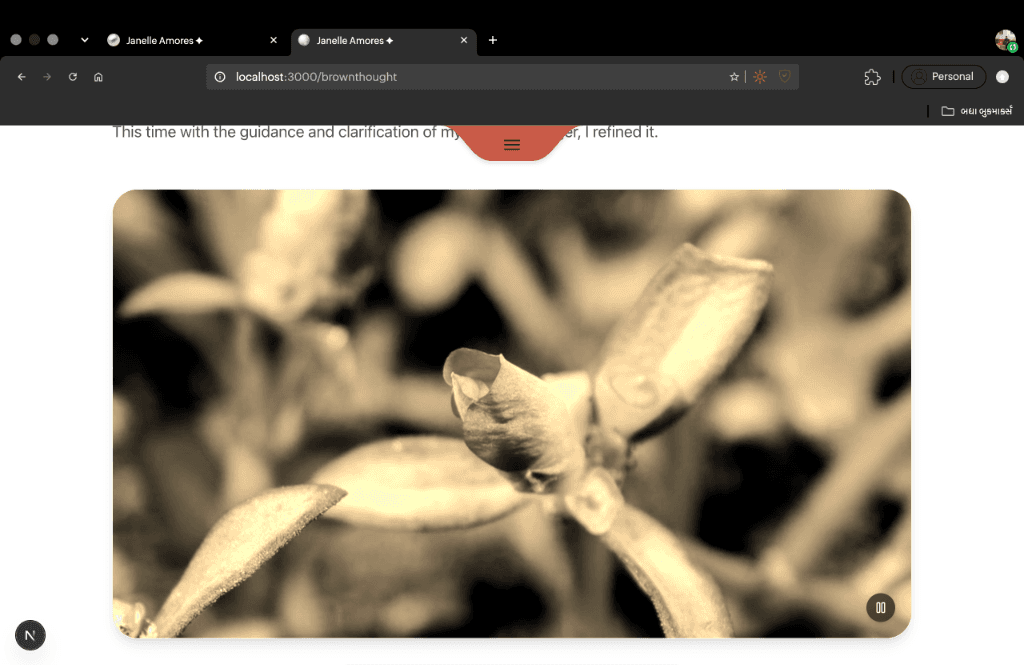
The Solution: Ready for Move-In
see it here
We finally built a home for Brownthought Academy 🫂🏡
The final website became a cohesive platform that centralizes the application process for Brownthought Academy, eliminating confusion and re-establishing trust and credibility with users. By providing a seamless experience that aligns with the high standards of Kultivate Labs, the platform has fostered meaningful engagement, as users navigate deeper into the platform. The result? Remarkable growth, with:
- •1,754% increase in page views, with users exploring multiple resources on the platform indicating strong content engagement and relevance
- •a 1,684% increase in visits year-over-year, pointing to increased traffic, improved brand recognition, and effective marketing campaign strategies leading to higher generated gross profit ($1.15M increase from 2022)
- •1,470% increase in unique visitors, indicating the platform reaching a broader audience and expanding its influence beyond its previous user base due to stronger outreach efforts, partnerships, and improved credibility
Key highlights of the solution include:
Knowing most users applied via desktop, we prioritized a robust desktop experience while ensuring responsive design for mobile. With over 70% of traffic coming from mobile devices, this forward-thinking approach positions the platform for future growth, adaptable to both desktop and mobile as user behavior evolves.
We created intuitive pathways that allowed users to explore the program, apply for internships, and access cohort-specific details — all in one place. No more hunting through fragmented sources. Navigation is now smooth, efficient, and crafted with the user at its core. This clarity contributed to users exploring multiple resources on the site, reflected in the substantial page view growth.
We revamped the visual design to ensure consistency with Kultivate Labs' brand, elevating user trust. The use of modern typography, updated logo placement, and well-organized content helped to foster credibility and align with users' expectations for quality design.
Points of Growth
Wishes🧚
I wish I was able to do more research on users, but, again, it is important to consider the limitations of a company's capacity and the resources that you are working with. I have to make the most of the resources that I am given.
I wish that interns got to contribute more to branding. I feel the website could benefit from a more modern aesthetic to align with current design trends that resonates more with target users. It would have been a great opportunity for us as interns to learn while adding fresh perspectives and ideas :)
While our team was able to provide informed design recommendations, some elements of branding could benefit from additional design craft and polish. I understand the constraints due to time and budget, but further refinement in certain areas could elevate the overall impact significantly.
Takeaways🥡
I thought this internship would help me to hone my overall technical design skills. I surprisingly spent most of my time on my team's FigJam board and actually working on the product, where I realized design is an extremely dynamic, multifaceted, and comprehensive process that changes depending on context.
Product design is about designing a product (surprising I know). This experience reinforced that product design is about creating solutions that balance design strategy with business impact. It's not just about visual appeal, but rather about how every element serves the user's needs and contributes to the overall product strategy.
Honestly, small clarifications or questions can lead to major product insights. This internship taught me that frequent collaboration is essential for aligning teams and making better design decisions.
Tackling these challenges has helped me identify key areas for growth — particularly in integrating Figma with other tools, refining my problem-solving process through constant iteration, and recognizing the importance of small details in shaping strategic product decisions. This clarity has strengthened my approach, giving me the direction to hone my craft as a more effective product designer.
© 2026 • Made with ❤️ in Bharat 🇮🇳 | Priyanka Gunjal™ • All Rights Reserved